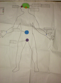
This first image is how my infographic idea started, as a human body with areas highlighted that displayed which areas of the body were effected. Each was color coordinated.
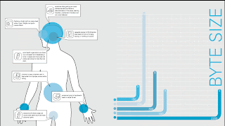
Next I went digital and threw in a graph to bring more information to the piece, letting you know the price and battery life of each object. I defined the areas of the body and my callouts were a little more interesting. My graph bars were color coordinating with its object.
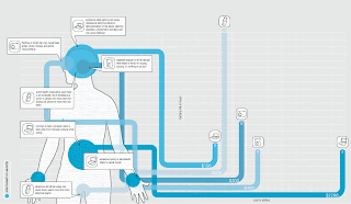
My final infograph is a revised version of the second. My graph bars connect to the area effected on the body and overlap, creating an interesting composition. the callouts remain the same and the graph bars have icons on their peaks to clarify what they refer to. a graph pattern covers the whole background to imply measurement.


 This first image is how my infographic idea started, as a human body with areas highlighted that displayed which areas of the body were effected. Each was color coordinated.
 Next I went digital and threw in a graph to bring more information to the piece, letting you know the price and battery life of each object. I defined the areas of the body and my callouts were a little more interesting. My graph bars were color coordinating with its object.
